ShopDreamUp AI ArtDreamUp

Deviation Actions


Suggested Deviants


Suggested Collections


You Might Like…


Featured in Groups


Description
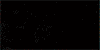
My commission for  of her Bleach OC Tokoyami Kakeru and his zanpakuto, Enmu Donko.
I had a bit of trouble with this one because of an unfortunate accident. Photoshop crashed after 5 hours of unsaved work. Somehow, I managed to have the presence of mind to quickly screenshot the painting before it disappeared into oblivion.
With that brilliance came trial, though, since I lost all of my layers. As a result, it's not *quite* as finished as I wanted it to be, but I did my best and worked for two hours on finishing it as best I could.
Learn from my fail and Always. Save. Your. Progress.
This helpful tip brought to you by Pandora
Hope you like it!
***FOR ***
***
The last time I received critiques, I was told that the hair looked stringy, that the clothing was flat, and that the facial features didn't fit the face. Have I corrected these problems? Do you see any others?
of her Bleach OC Tokoyami Kakeru and his zanpakuto, Enmu Donko.I had a bit of trouble with this one because of an unfortunate accident. Photoshop crashed after 5 hours of unsaved work. Somehow, I managed to have the presence of mind to quickly screenshot the painting before it disappeared into oblivion.
With that brilliance came trial, though, since I lost all of my layers. As a result, it's not *quite* as finished as I wanted it to be, but I did my best and worked for two hours on finishing it as best I could.
Learn from my fail and Always. Save. Your. Progress.
This helpful tip brought to you by Pandora
Hope you like it!
***FOR
***The last time I received critiques, I was told that the hair looked stringy, that the clothing was flat, and that the facial features didn't fit the face. Have I corrected these problems? Do you see any others?
Image size
537x593px 357.86 KB
© 2010 - 2024 KurosukiPandora
Comments29
Join the community to add your comment. Already a deviant? Log In
Hello and thank you for submitting to "iconcritique-it!" again!
Well, I remember seeing this image before and I don't really see very much changed from what I recall from before. This suggests to me that the changes made must not have been very severe? It is possible I am just mis-remembering. Let me see if I can help you out!
First off, painting hair can be really fun! Let me toss you a good tutorial that I used to learn to paint realistic hair: [link]
The hair does indeed still look stringy. Part of the probelm is that it doesn't really appear to flow in a natural pattern. I know you are going for a fan character from an anime, but when you are mixing anime style with realism it is hard to find a good balance. The hair on this doesn't look natural enough to be realistic, but doesn't look simple enough to be anime, so it is hard to find a happy medium. If you are going to do anime and realism together, you need to work out a balance that fits both styles and brings elements of both styles in, rather than mixing it so much. If the hai is going to stand up at odd angles, it might be better to simplify the style you use to paint the hair rather than painting individual strands. The strands stand out and are what make it appear stringy. The fact is that on the left where his hair goes down along his back, I can see right through it. The hair does not appear to have any bulk. If you want to go more realistic with it, lose the super curl on the left that stands up so unrealistically and relax the bits that are standing out around his face so they look more like a natural curl. Either way, you need to build the hair up by starting from a base of the darkest color present in the hair, and adding lighter and lighter colors layered upon each other until you come to the highlights. Finally, touch it up with a little more shadow and highlighting using your darkest and lightest shades. This gives the hair a realistic look. If you are going to go more simple with it, use only a limited pallet and don't paint individual strands. Rather, suggest the strands with a few interesting bits of lineart.
Now, moving on to the face, I would say that the thing that you need to fix most on the image is that his eyes are not set evenly. The one on the right side of the image is higher than the one on the left. Even if I tilt my head to allign with how his head is tilted, that eye is too high. It should be an easy fix with a lasso tool, move it down and then smooth out the skin around it since you're working digitally. Remember to use guidelines to get your facial proportions right! The hose and mouth are pretty good, though the nose does look slightly crooked.
The arm has a very rough edge. I imagine you were working in separate layers when painting the skin and clothes? I do the same thing... But here is how to get rid of that rough edge along the skin. When you are finished with most everything on the image, flatten the layers and go back over all the edges, smoothing them out so they interact with each other naturally. Use a soft edged brush with a low opacity setting, around 20% works well for me. Take it and just smooth out all the edges with a color that fits. Remember to reflect a little of the color from clothes onto skin and vice versa where appropriate.
Now that hand... is obviously some kind of magic. This looks electric or spirit-like. I'm not sure which you're going for... But you should soften the edges of the glow to make it appear more fantastic. The clow could also have more contrast to give a better effect. Where the skin color cuts off, you should smooth it out and gradiate it to give it less of the look that his hand is just cut off there.
Also, his shoulders are not set evenly and the shoulder in the foreground looks too large. It should be brought in a little. Never be afraid to use a reference photo! Anatomy is hard! His abs also appear to be facing the viewer almost directly while his chest is pointing to the side. Make sure to keep consistency all across a drawing to ensure it feels realistic. The belt buckle, likewise in that, should be pointed more to the side.
The tattoo along his arm also looks very out of place. It should be smoother and blend in with his skin more. It feels rushed as it is. The edges are not smooth or even. You should do a tattoo on a separate layer from skin and take your time with it, then lower the opacity on the layer to help it blend with the skin.
I did my best to find as much as I could to help you with! I hope that this is all helpful to you in trying to improve your art! I wish you all the best and let us know if you need further help!